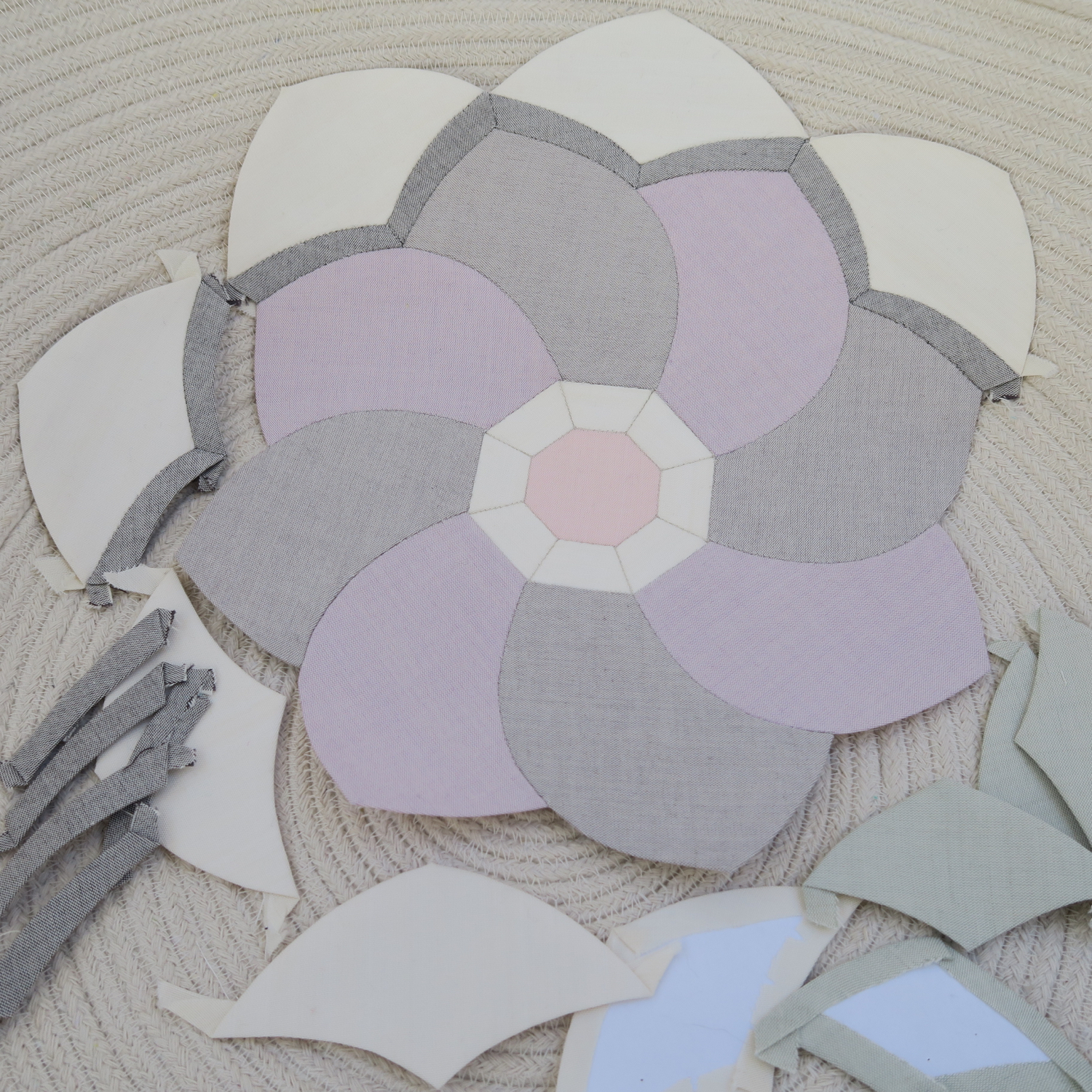
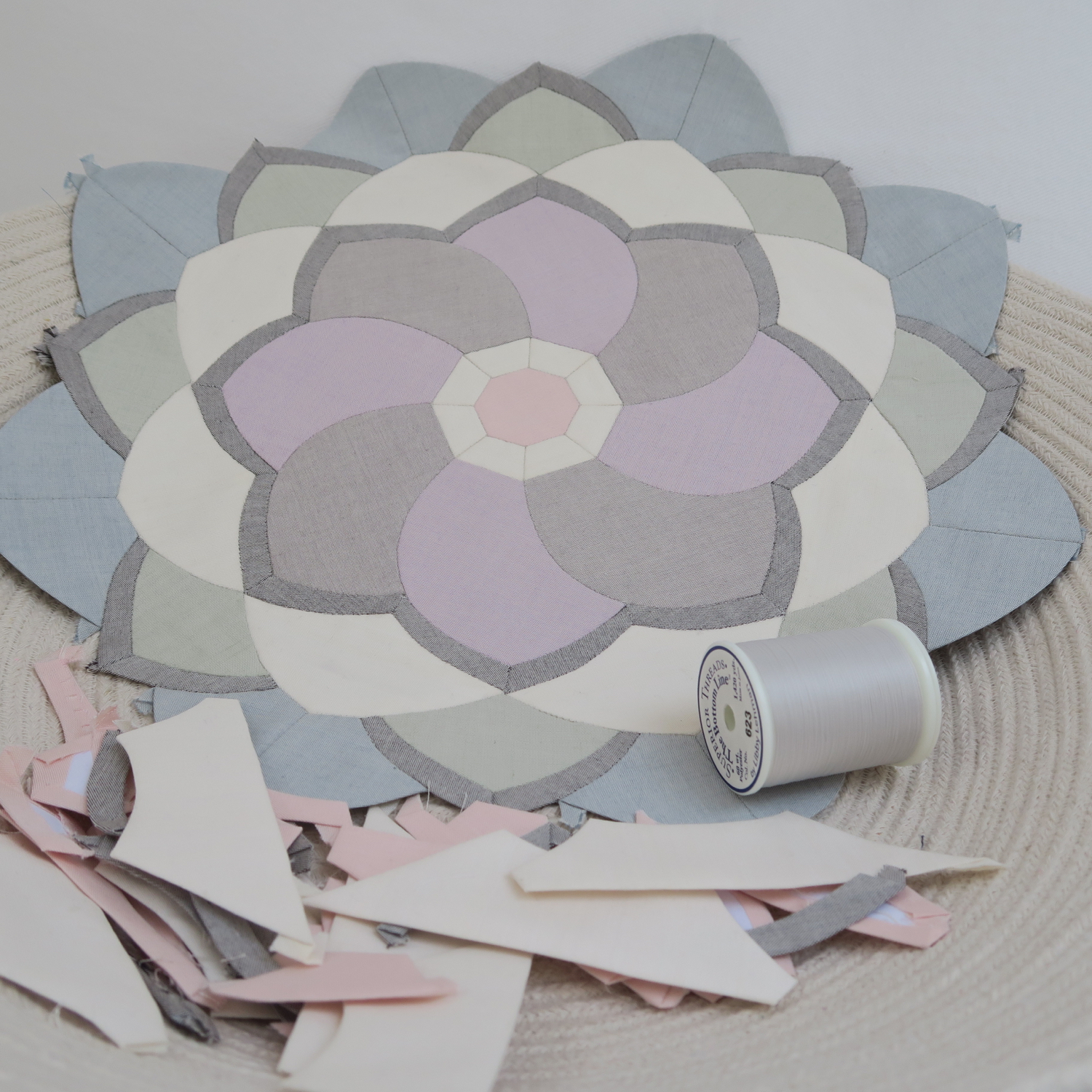
The end of April and beginning of May have proved to be Three Weeks of Illness around here. Just as I'd got better from the last bug, I was suddenly hit with a dose of flu, which was surprisingly more debilitating than I'd first thought when it initially arrived in our house in the form of man-flu, and it came complete with tonsillitis for me (which felt particularly sneaky due to it not declaring itself with the first sufferer due to his lack of tonsils). But it's amazing what can be achieved when you are in confinement and forgo a social life - this flower feels like it's sewn itself.

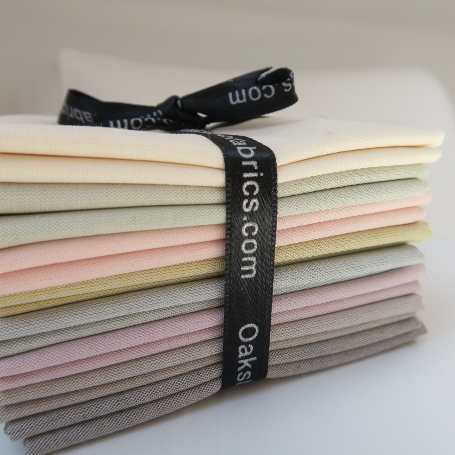
I noticed something odd happening while I was constructing this flower though and I'm wondering if anyone else finds themselves doing the same. When yellow is the predominant colour (I'm looking at you, Perpetual Spring) then I'm a huge fan and celebrant of the colour, however, the moment it's mixed in with other colours, I find myself wanting to root the yellow out. And so despite this gorgeous bundle of Oakshotts including a yellow and it looking completely delightful in bundle-form, every time I've cut some petal pieces from it, I've ended up discarding them.
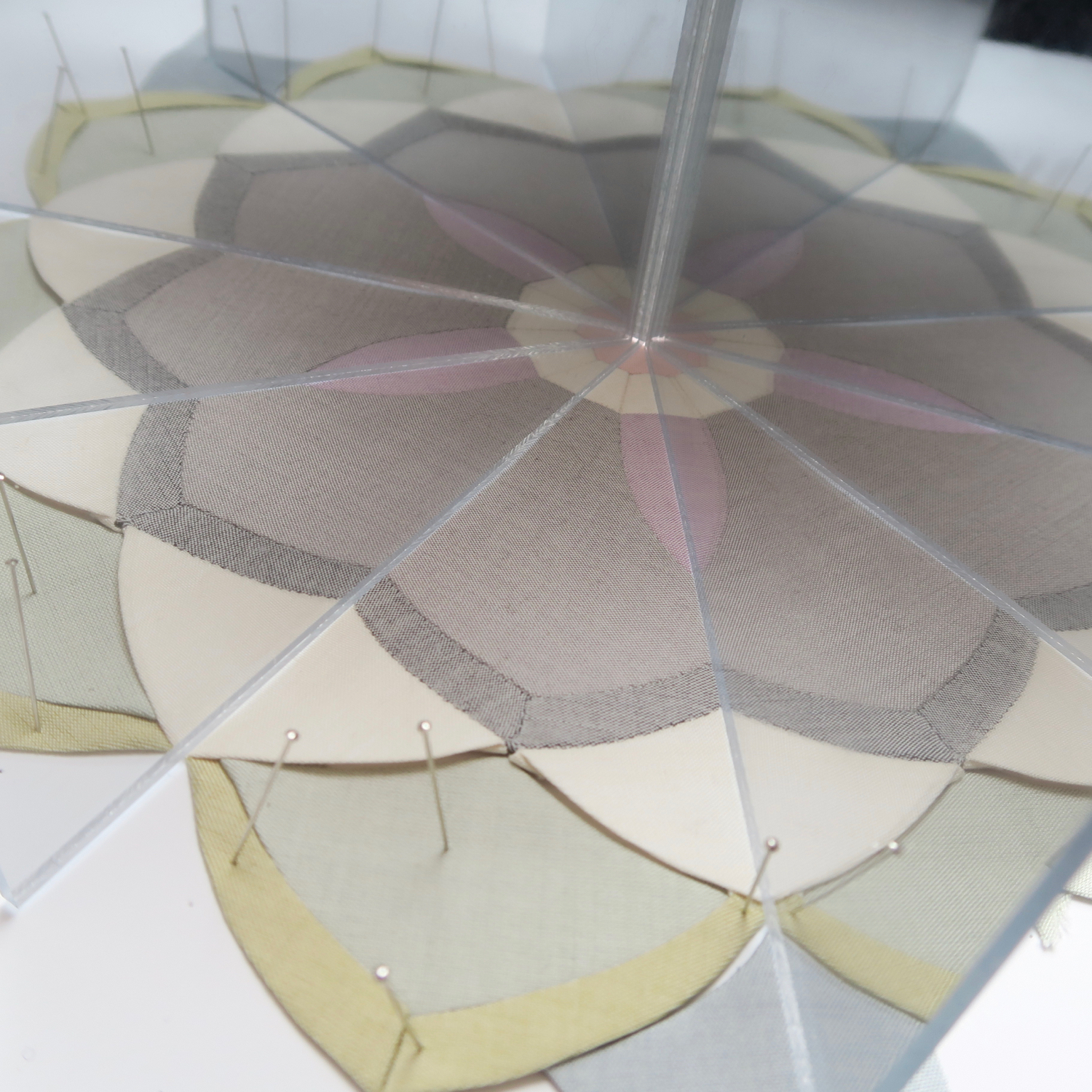
You can see a mock-up of some yellow inclusion in my magic mirrors above. I found the same thing when piecing my passacaglia cogs - despite the fact that it's seemingly just a riot of colours, I just couldn't seem to make the yellow work for me in there.
So my flower is continuing to bloom ever-larger as a yellow-free zone, which feels a shame as I loved how the colours looked in bundle form. But I'm interested to know whether anyone else stumbles around the colour yellow and whether there's any art/science theory behind this or whether it's just my own loopiness. I know that yellow is perceived as the brightest colour by the human eye, in part because it reflects more light, so perhaps it's just a personal eye-thing of the yellow jarring because it seems so much brighter than the other colours? Or maybe it's because unless I'm actively craving a rainbow (as for this pencil case or this quilt, neither of which would have worked without the yellow), then yellow adds too much jauntiness.
I'd love to hear how you feel about yellow - or whether you have a colour that you feel like this about that isn't yellow. I did actually struggle with the lilacy colour at the centre of this flower too, but included it on the basis that I was in danger of eroding the glorious Oakshott Scandinavia bundle of its intrinsic loveliness....there's always a danger that I could end up working entirely in shades of white.
Wishing you a lovely weekend,
Florence
Ps. And no, it's not an illusion, nor is the flower absolutely tiny: the rope bowl holding this flower is absolutely vast! Rope bowl tutorial, here.
Pps. I'm planning on writing the pattern for this flower once it's finished, if you're interested.
ADSENSE HERE


